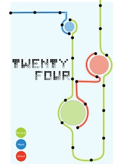
Twenty Four
This is my piece I did in Advanced Typography. The assignment was to log our life for a day and then in some underlying grid structure illustrate it. We also had to make our own font on the Fontstruct website and use it in our piece (while making the typeface we were not aware that we would apply it to this project). So my concept was to find an organic smooth way to illustrate my day to reflect my type. Inspired by the London Underground map, which is a perfect example of a document that is informative but also very simple. This documents my travels…
…click for larger view


Comments are closed.
Very nice.